The redesigned Dialpad homepage introduces a range of enhancements aimed at improving user experience, optimizing content structure, and increasing conversion rates. By refining the visual hierarchy, ensuring better content organization, and introducing more flexible design elements, the new homepage provides a more engaging and seamless experience. These improvements also align with Dialpad’s evolving brand identity, reinforcing clarity and accessibility across the platform.
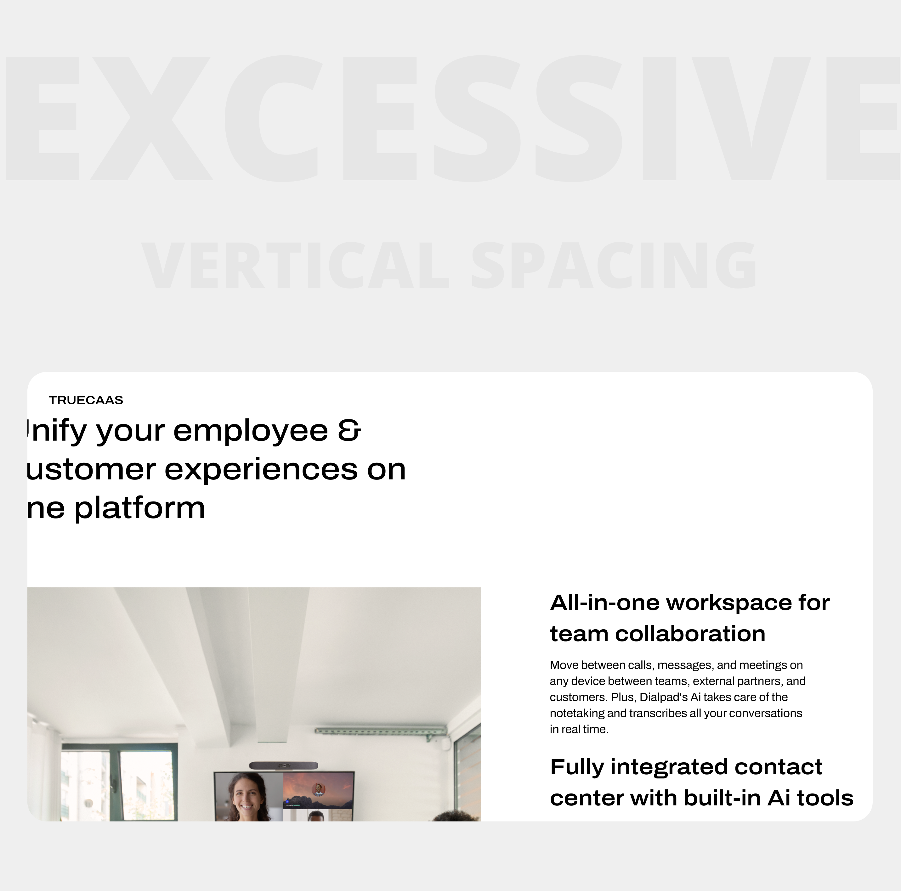
Optimized Content Structure: Reduced vertical space to improve information density and conversion visibility.
Viewport-Optimized Imagery: Ensured all visuals fit within browser viewports for a cohesive scrolling experience.
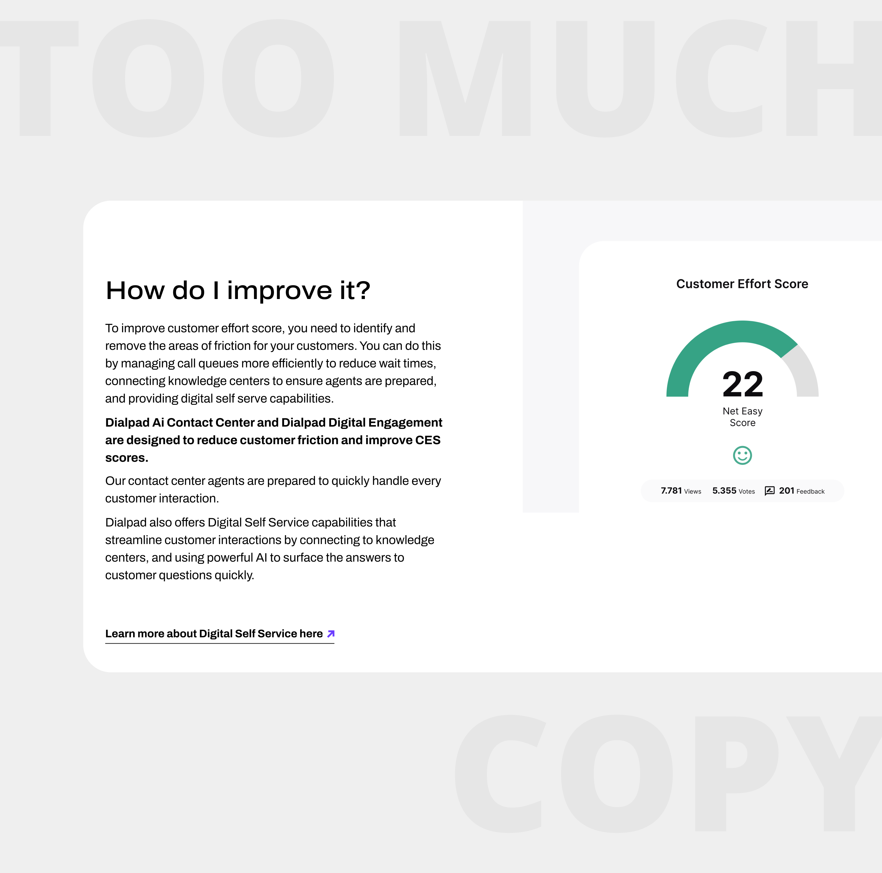
Copy Length Guidelines: Enforced word count limits tailored to page objectives and user journey stages.
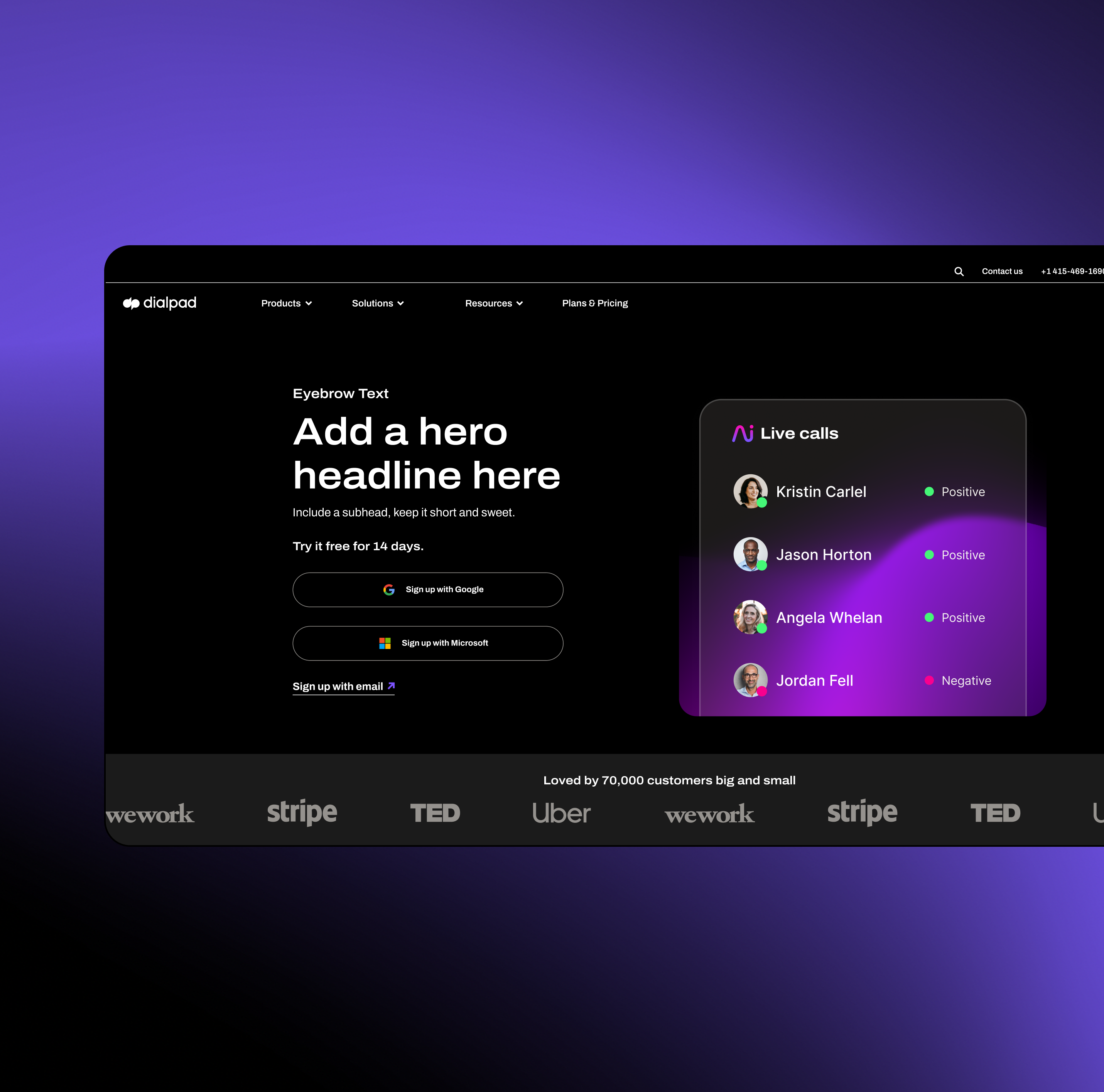
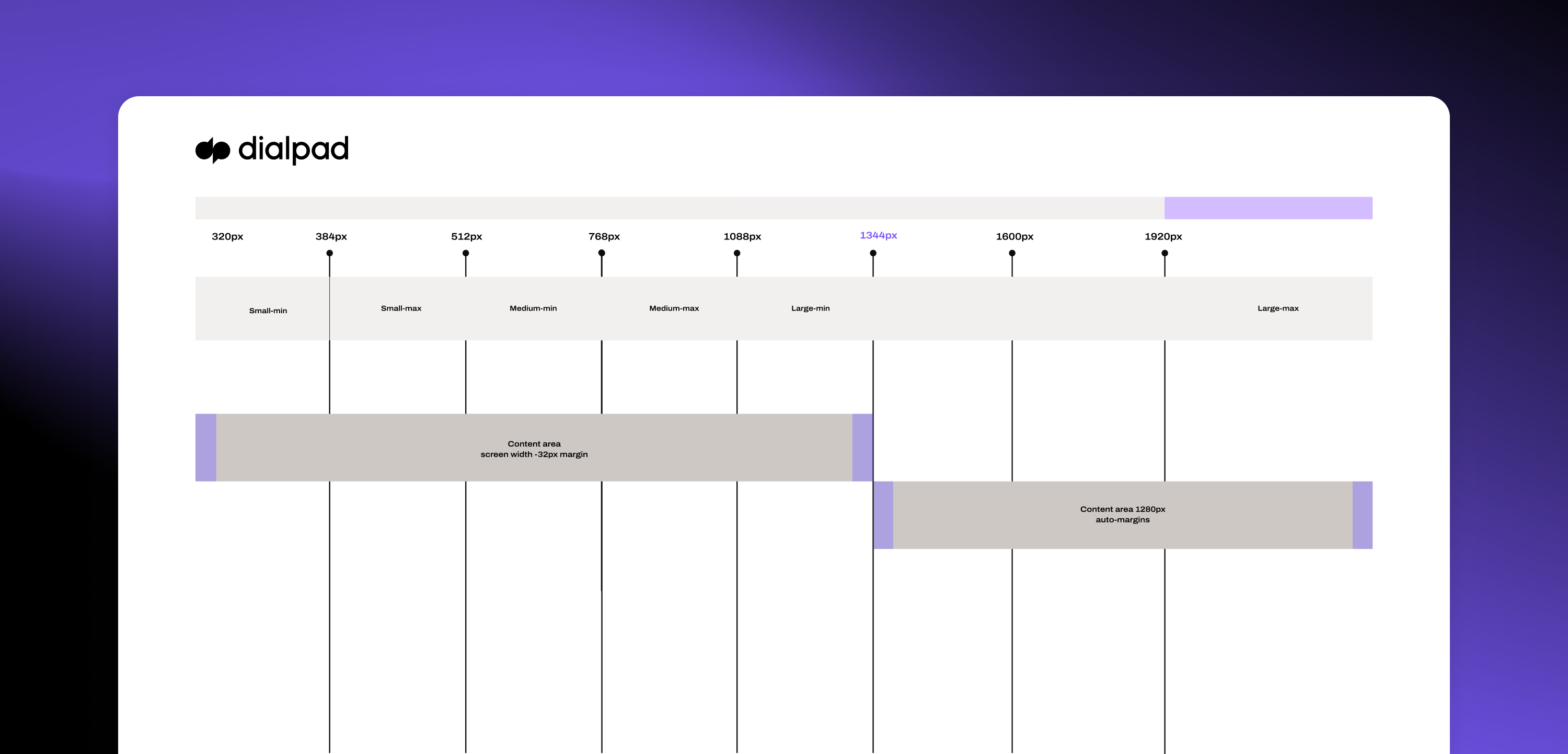
Consistent Content Width: Standardized max width to 1440px for uniformity across devices.
Dynamic Background & Layout Options: Introduced flexible background color choices and full-width sections to enhance page flow and emphasis.