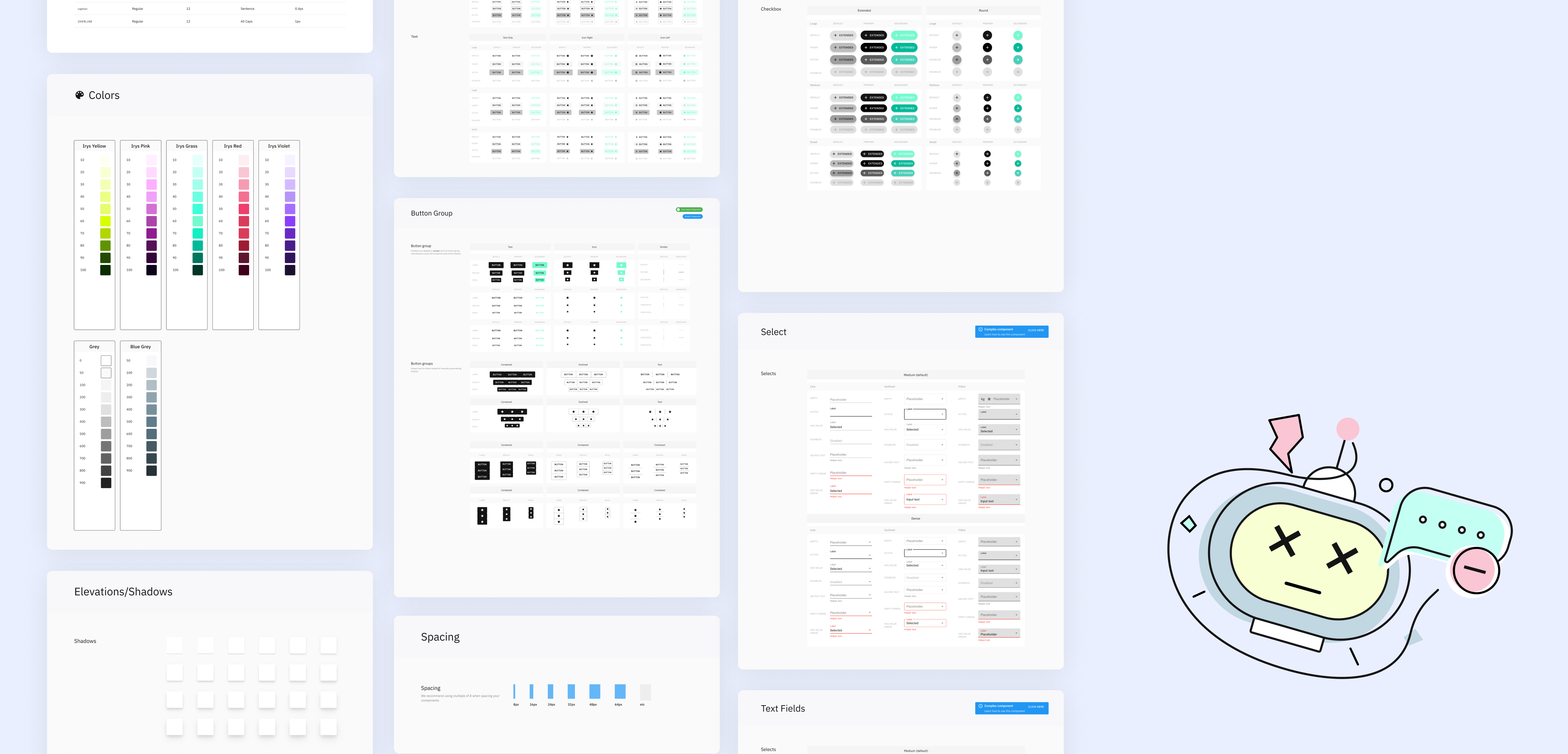
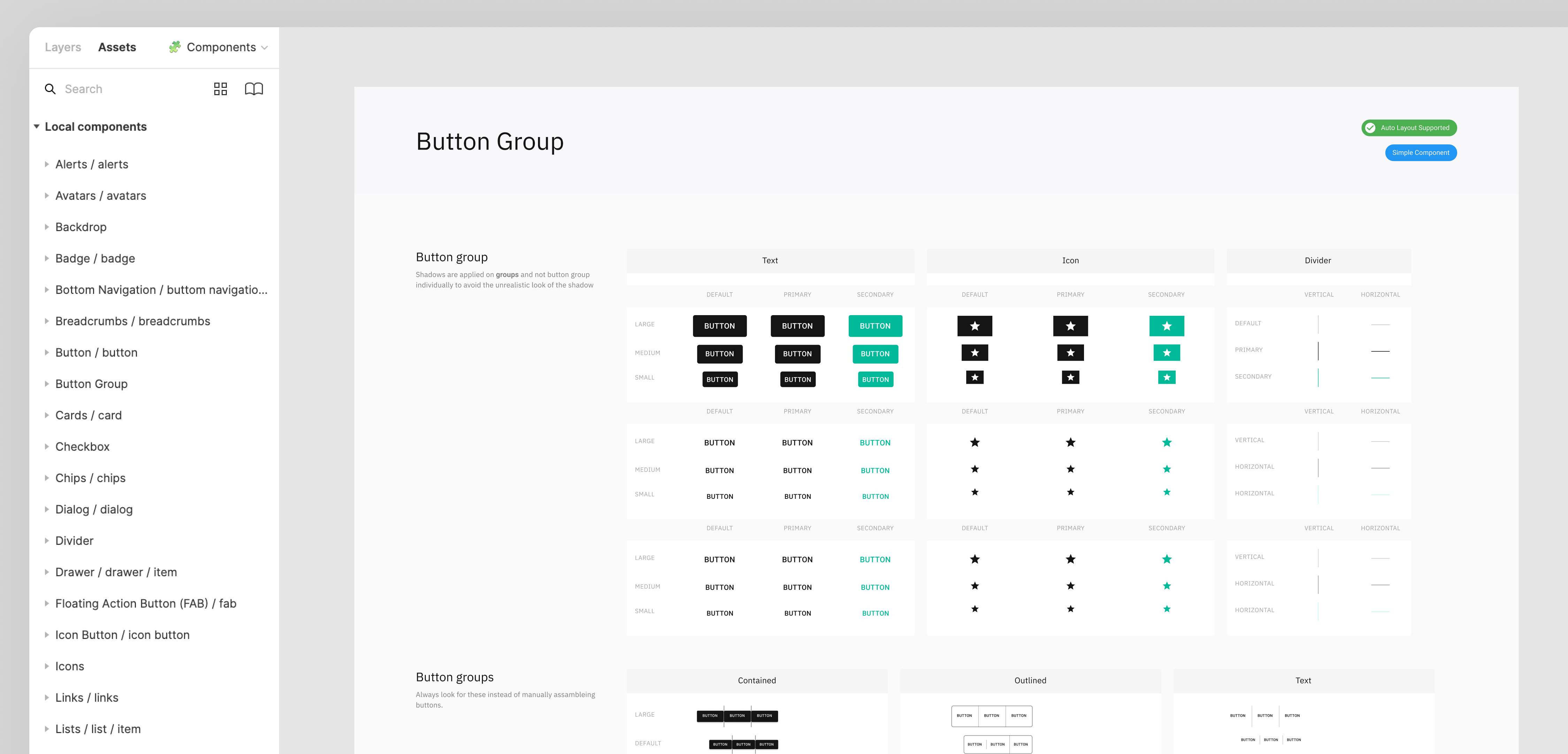
Establish a unified design language across both the mobile and dashboard experiences
Ensure all components meet WCAG 2.1 AA guidelines for inclusivity.
Enable fast iteration and development through reusable components.
Provide a flexible system that can evolve with new features and integrations.
Utility-based classes reduce custom CSS, speeding up implementation.
Predefined scales maintain a uniform layout system.
Mobile-first approach ensures seamless adaptation across devices.
The design system was built to be fully compatible with React, enabling component-based architecture for reusability.
Improved maintainability through structured component organization.
• Primary Font: Inter (for readability and modern appearance)
• Size Scale: Predefined text styles for headings, body, and captions.
• Line Height & Spacing: Optimized for legibility across different devices.
• Primary color: #00B999 (Green - Success & Community Engagement)
• Neutral Palette: Shades of gray for backgrounds, borders, and text contrast.
• Error & Alert Colors: Red (#DC2626) for errors, Yellow (#FACC15) for warnings.
• Button Variants: Primary, Secondary, Outline, and Disabled states.
• Accessible Click Areas: Ensuring touch-friendly targets (minimum 44px height).
• Form Elements: Input fields, checkboxes, radio buttons, and dropdowns designed for clarity and usability.
• Sidebar Navigation (Dashboard): Optimized for quick access to key sections.
• Tab & Breadcrumb Navigation: Enhancing user flow and discoverability.
• Color Contrast: Meets minimum contrast ratio for text and UI elements.
• Keyboard Navigation: All interactive elements are fully navigable via keyboard.
• Screen Reader Support: Proper ARIA labels for enhanced accessibility.
• Focus States: Clear visual indicators for focused elements.
• Adaptive Layouts: Components resize dynamically across different screens.
• Touch-Friendly Elements: Larger tap targets for improved usability on mobile.