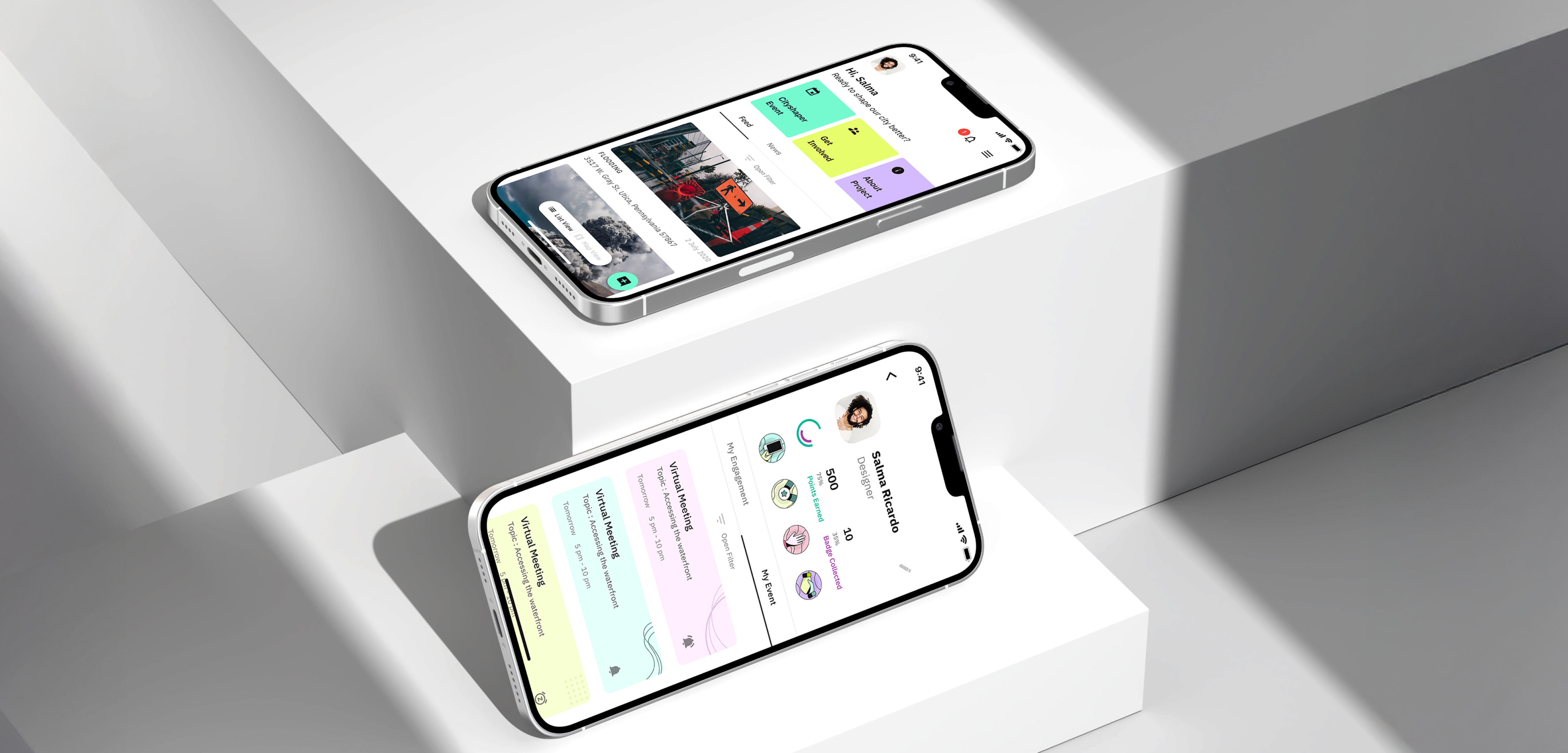
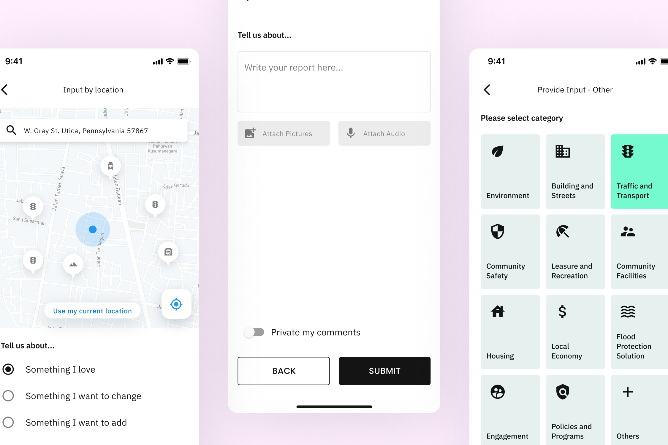
UX/UI Design

Case Study

Irys Technologies

Role

Product Designer

Deliverables

Mobile App

Released

October 2021

Industry

Civic Engagement

Irys*

Designing a civic platform people actually want to use.

Where engagement breaks down

Most civic apps don’t fail because of technology. They fail because people stop caring.

When I started working on Irys, the problem wasn’t just reporting urban issues, it was that users didn’t believe anything would happen after they did.

Looking beyond the surface The problem wasn’t reporting, it was everything around it.

From the outside, everything seemed in place: users could report issues, governments could receive them, and data was being collected. But the experience told a different story. Reporting was slow and frustrating, there was no visibility after submission, and no real reason for users to come back.

NO FEEDBACK

NO TRUST

NO RETURN

NO FEEDBACK

NO TRUST

NO FEEDBACK

NO TRUST

NO RETURN

NO FEEDBACK

NO TRUST

The Solution

I redesigned the experience around three principles: making reporting easier, increasing visibility after submission, and giving users a reason to return.

Steps reduced

Clear report categories

Faster report input

Reduced user friction

Structured form layout

Guided user flow

Fewer input errors

+42% completion rate
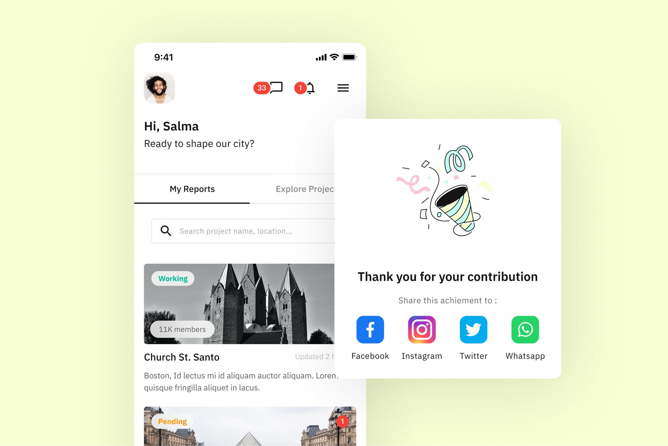
Real-time updates

Clear system feedback

Issue status tracking

Transparent process flow

Improved user trust

Structured data hierarchy

Cross-platform visibility

-30% support requests

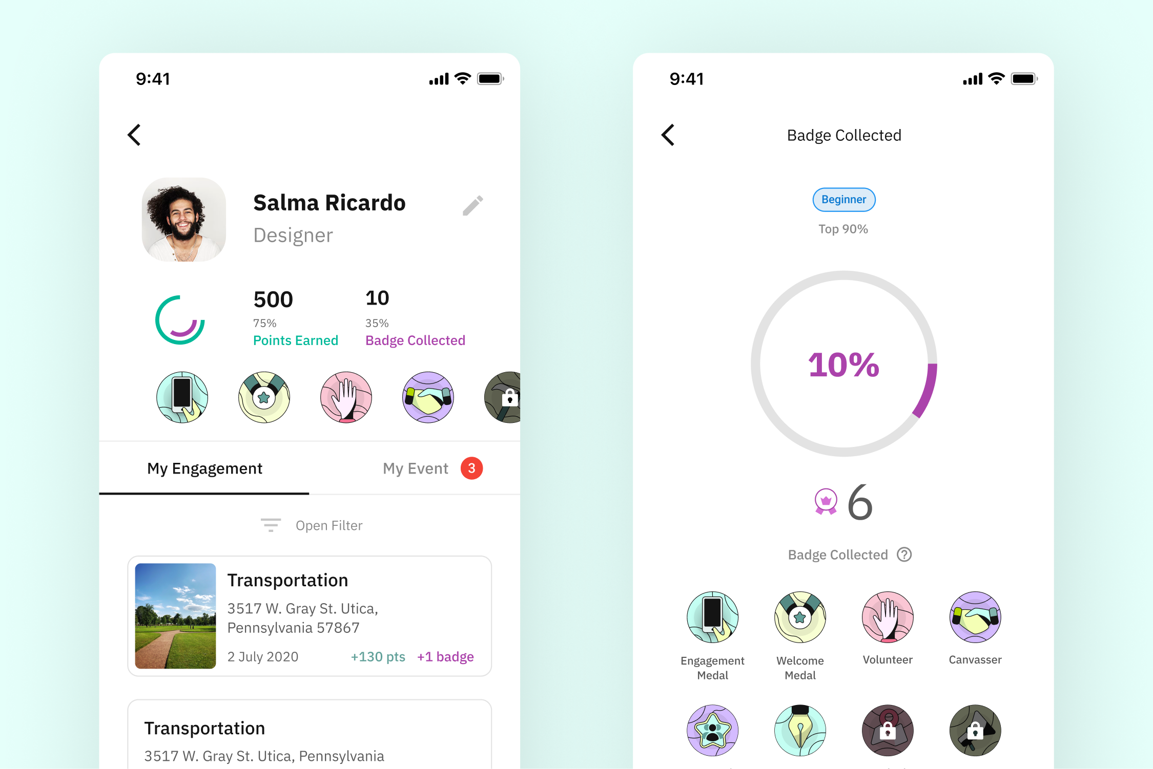
Gamified experience system

Points and rewards

Return user incentives

Increased user motivation

Higher participation rate

Behavior-driven loops

Repeated user actions

+27% returning users

Process Workflow

A structured approach focused on understanding real user behavior, defining clear problems, and building solutions that scale. Every decision was grounded in research, validated through iteration, and connected to business impact.

Conducted user interviews and behavioral analysis to uncover friction beyond the surface. Observed real interactions to identify gaps between expected and actual experience. Journey mapping and feedback revealed that lack of visibility after reporting was the main driver of low trust.

Understand the problem

01

Synthesized insights into clear problem statements using affinity mapping and pattern recognition. Identified recurring themes and structured them into key opportunity areas. Reframed the challenge from improving reporting flows to building trust and encouraging users to return.

Define and reframe

02

Started building the design system in parallel with research to ensure consistency from the start. Defined components, layouts, and interaction patterns across product surfaces. This foundation enabled faster iteration and supported both the app and dashboard experience.

Design the system early

03

Built interactive prototypes in Figma to validate key flows early in the process. Tested solutions iteratively with users to refine usability and reduce friction. Each iteration improved clarity and made the experience more intuitive and aligned with expectations.

Test, iterate, improve

04

What I learned

What used to end at submission became the beginning of an ongoing interaction.

Instead of reporting and leaving, users could follow what happened next, track progress, and understand the impact of their actions. Over time, points, badges, and visible contributions made the experience more engaging, something users wanted to return to, improve, and stay involved with.