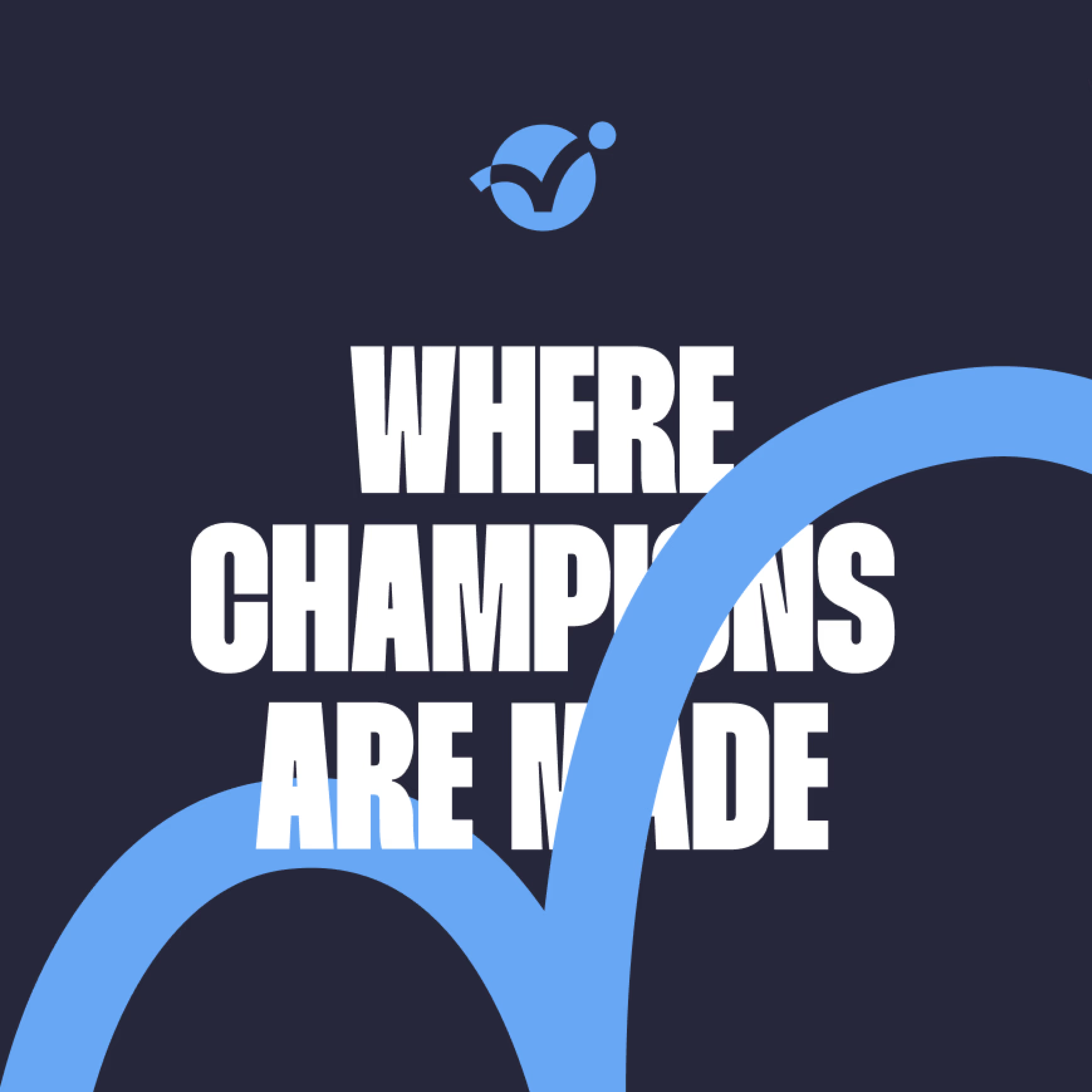
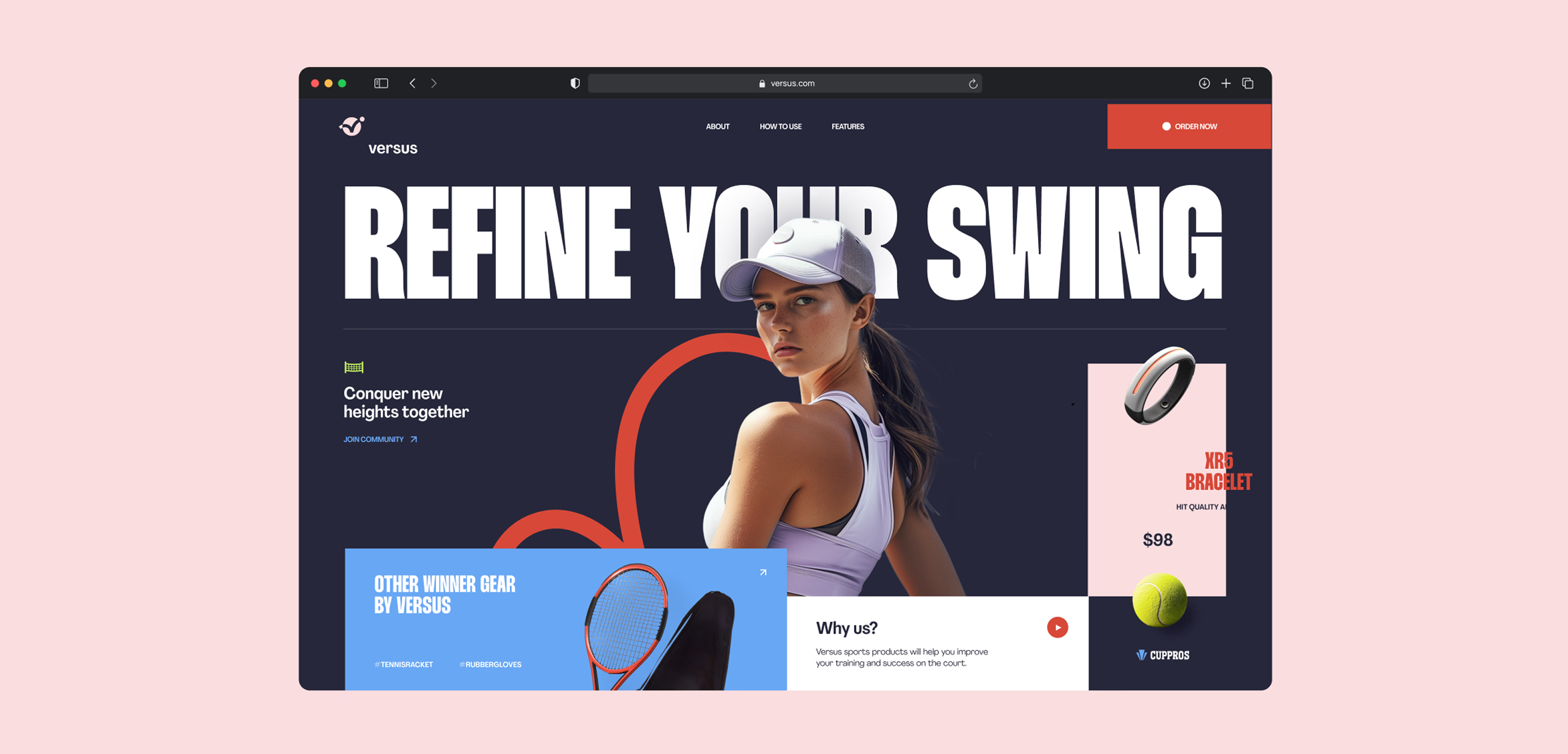
Versus is the place where champions are made
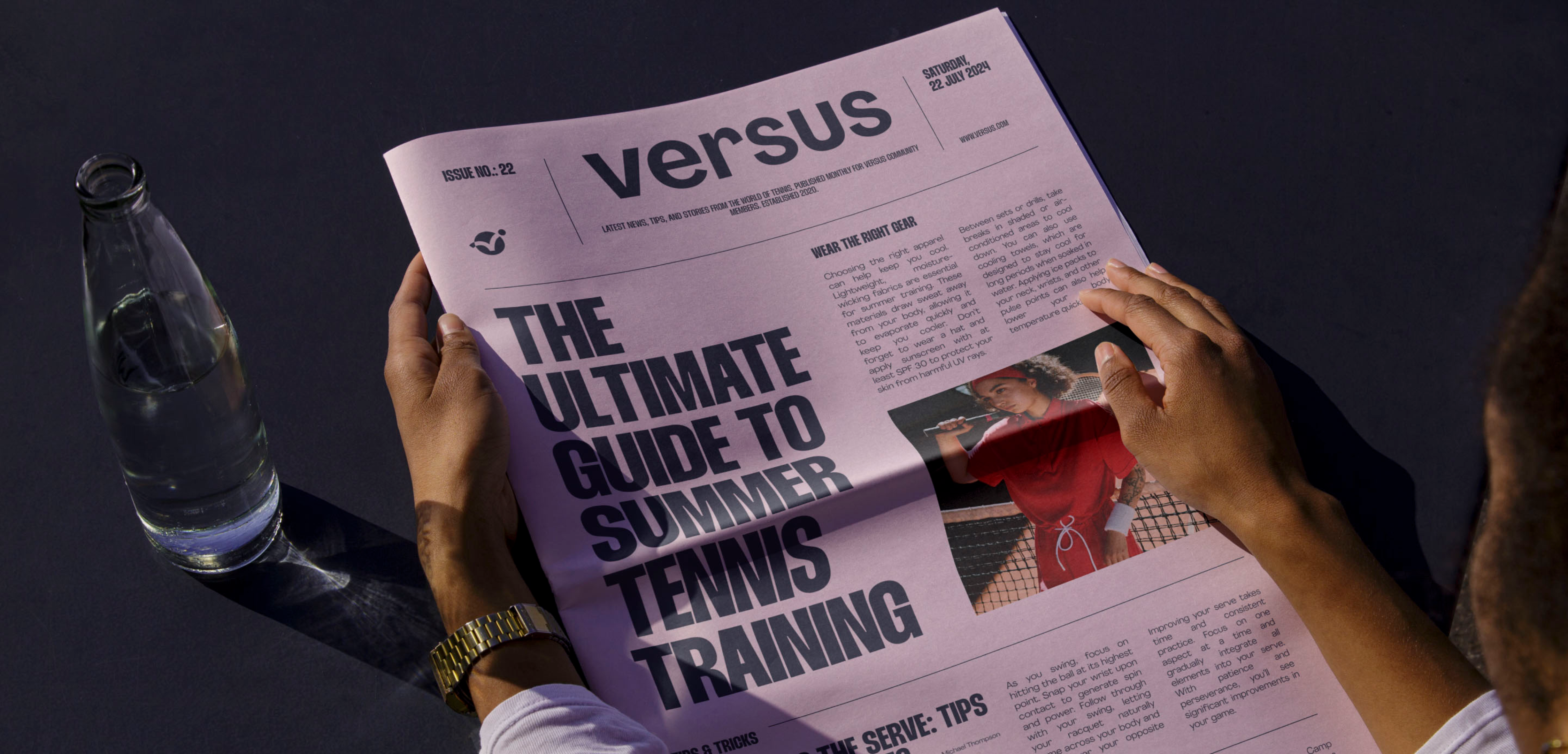
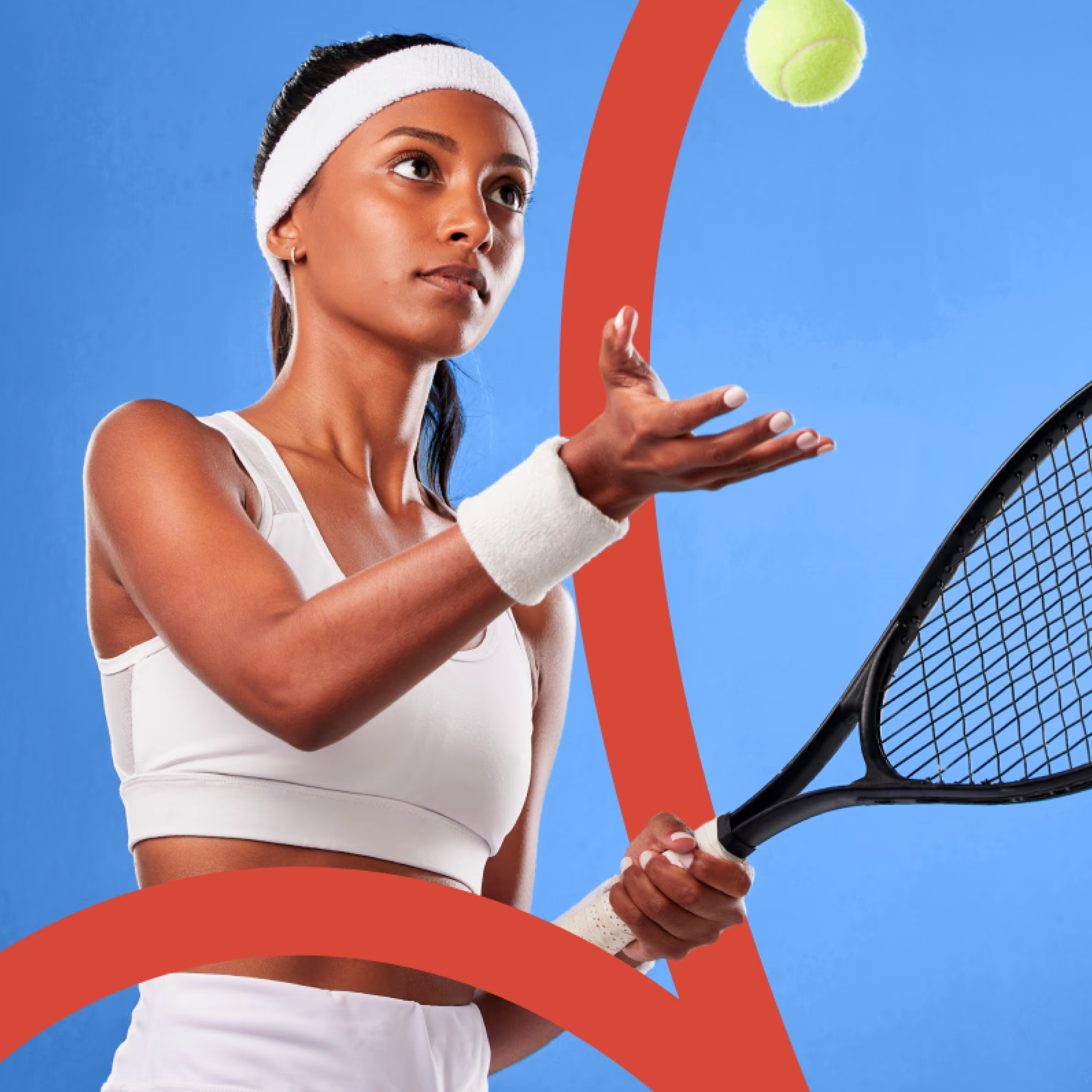
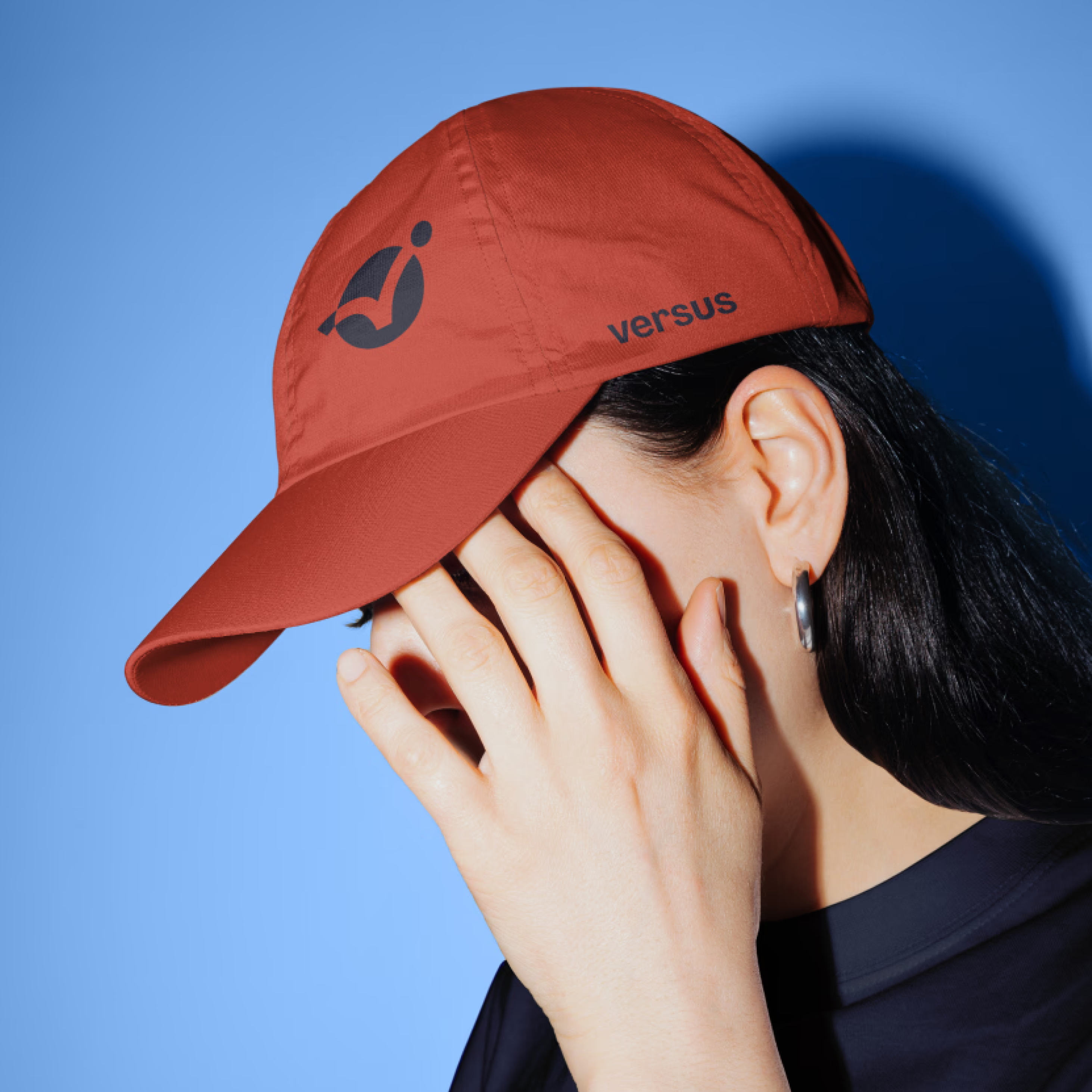
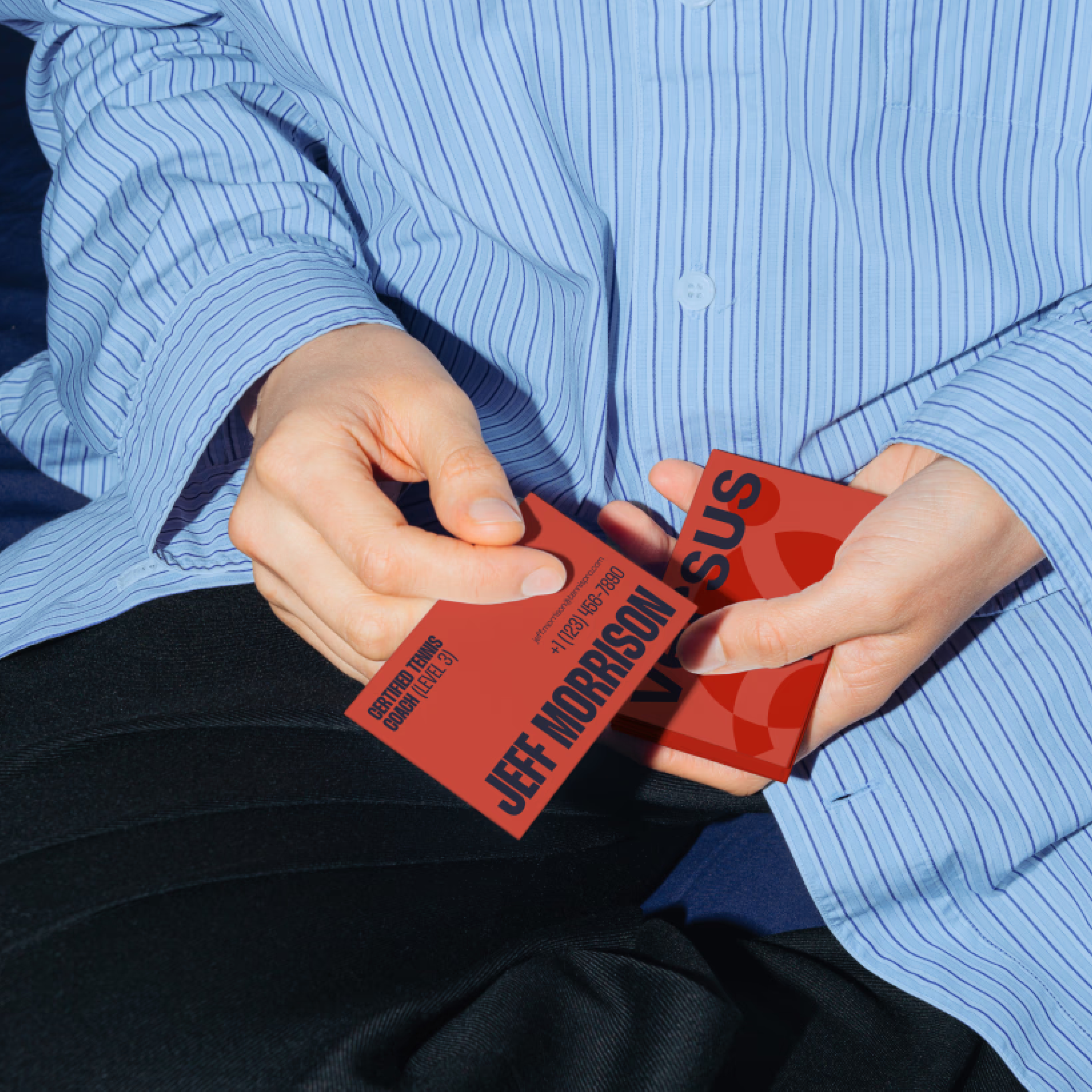
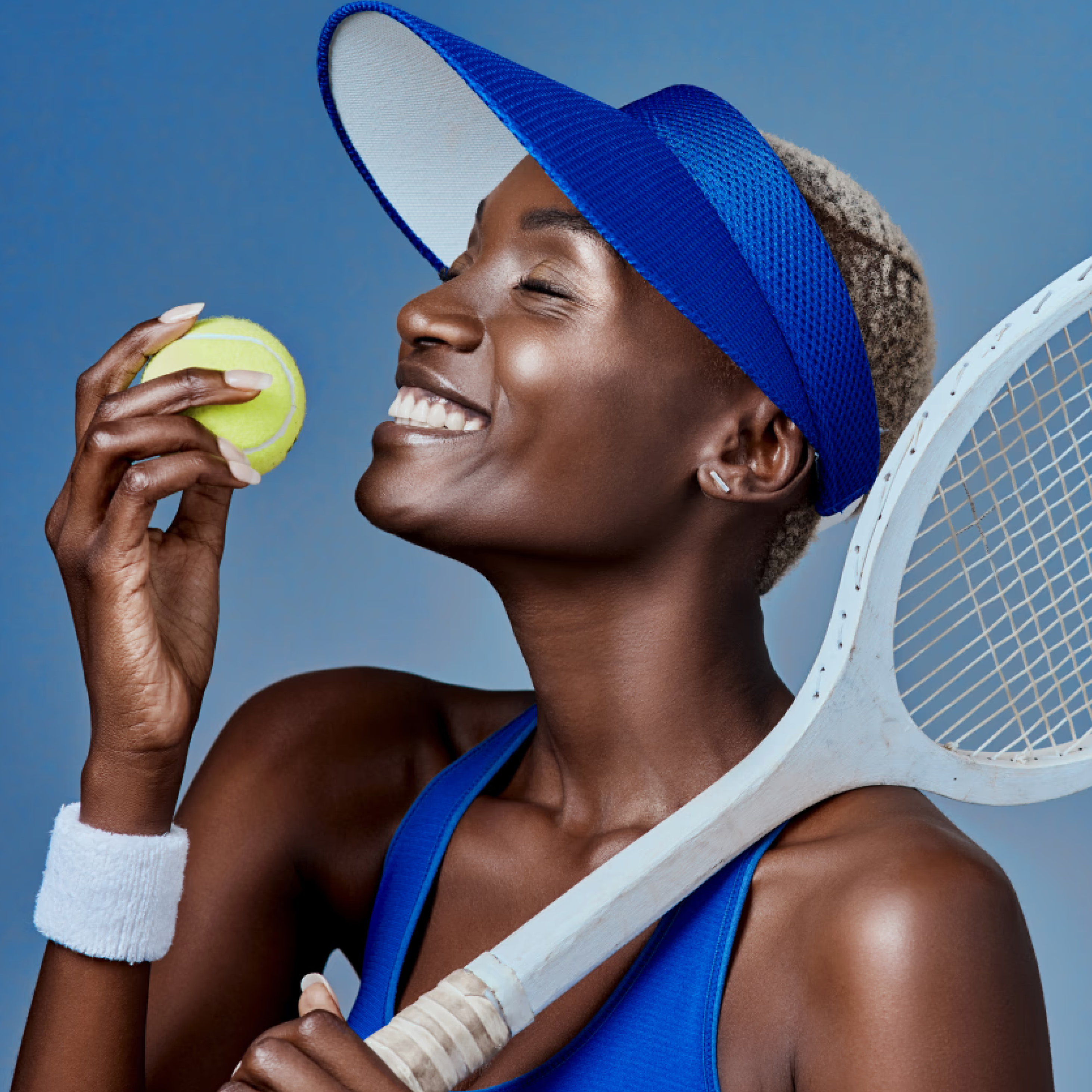
We carefully curated a selection of impactful photography featuring players in motion, showcasing their determination, focus, and skill. The dynamic imagery captures the essence of the sport, making the platform feel alive and engaging. These visuals are complemented by energetic layouts, bold typography, and strategic placements of content to guide users through an intuitive and inspiring experience.
To further reinforce the competitive spirit, we crafted messaging that speaks directly to athletes’ aspirations. Phrases such as “Rise to the challenge,” “Define your legacy,” and “Compete like a champion” are integrated into the platform to continually motivate users. Every design choice— from the color intensity to the structured composition—aims to build an emotional connection between the player and the brand, making them feel part of something greater than just a game.
Through this approach, Versus transforms into more than just a tennis platform; it becomes a movement—a space where dedication meets ambition, and where every player has the opportunity to become the best version of themselves.